Prototypes
The move between low-fidelity wireframes and high-fidelity prototypes was performed by adding general typography as well as adding animations which modeled how users could interact with various UI elements to change the information displayed on-screen.
The RIT brand color palette and general style guide was used as a basis for color and font, although small additions were needed (such as the color variations of the calendar tiles). Most of the structural changes that arose when moving to high-fidelity were a result of insufficient color contrast (the inability for users to visually distinguish between two elements on the page). Conversely, it also enabled us to change some text to visual elements and use color contrast to convey information (such as the degree progress bars near the top of the page. Certain UI elements have been refactored to eliminate the “Russian Doll” effect of many containers within containers; this can be seen primarily within the dropdowns in the Academic Requirements section. Core UI elements and large sections of information remained unchanged, and the design is still represented in a single-page application (SPA).
All Hi-Fi design creation was done in Figma using “Flows” to prototype the various interactions that would cause the display of information to change on the page. Within the prototype, elements such as dropdowns, menus, tooltips, and popovers have been modeled. It should be noted that not all possible interactions have been modeled, but at least one example of each different type is accessible (e.g. Not all dropdowns have been made interactable, but at least one can be used to test how functionality would work across all instances of the same element).
Desktop
Tip: Click inside the frame to show the controls, then use the button at the top-right of the frame to view the prototype in full-screen mode.
Mobile (Smartphone)
Tip: Click inside the frame to show the controls, then use the button at the top-right of the frame to view the prototype in full-screen mode.
Video Walkthrough
Please see below for a short video walkthrough explaining the core UI elements of the service as well as various interactions and features found within.
Welcome to a brief overview of the prototype for the RIT Degree Tracker, a project completed as part of the Information and Interaction Design class at RIT.
Starting with the page header, we find the RIT logo and site name on the left side, and two interactable elements on the right. The first of these is the notification menu, which displays a list of all read and unread notifications pertaining to the logged-in student. The presence of an orange orb on the notification icon denotes that the student has unread notifications. Clicking on the notification icon will open a dropdown of all student notifications. These may vary from general notices to degree-specific information, which may be time-sensitive.
The second icon in the header, accompanied by the student’s name, displays a list of various settings the student can change in regards to their personal information. The options in this menu were pulled directly from the “Personal Information” section of SIS, and would link externally to those pages, so they are not included in the scope of this prototype.
Moving down the page, the first dynamic element to be found is an alert banner immediately following the header. This displays any notifications which are deemed serious enough to also be included outside of the regular notification menu, and are almost always time-sensitive. Students are able to dismiss this notification by clicking the “X” at the right side of the banner.
The student dashboard is located slightly below the alert banner, which displays an aggregated overview of most information found in the degree tracker. The top half displays pertinent information about the student; their name, degree program, university ID, and any academic or faculty advisors. Below this, three main sections fill out the top panel: the overall degree progress, the amount of the degree that’s been completed, and the student’s overall GPA.
The overall progress section is broken out into several categories which represent the different types of classes students must complete to earn their degree. These vary by degree, but placeholders are shown in this prototype. Progress bars as well as text denote how far a student is to completing each requirement individually.
Without individually tallying the credits completed and comparing them against the total credits required, the student is able to see the percentage of the degree that they’ve completed simply by referencing the “Degree Completed” progress circle located in the middle.
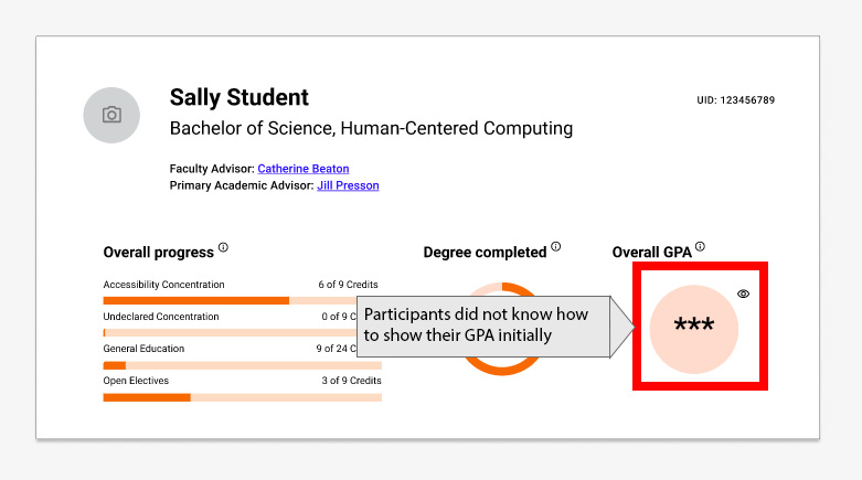
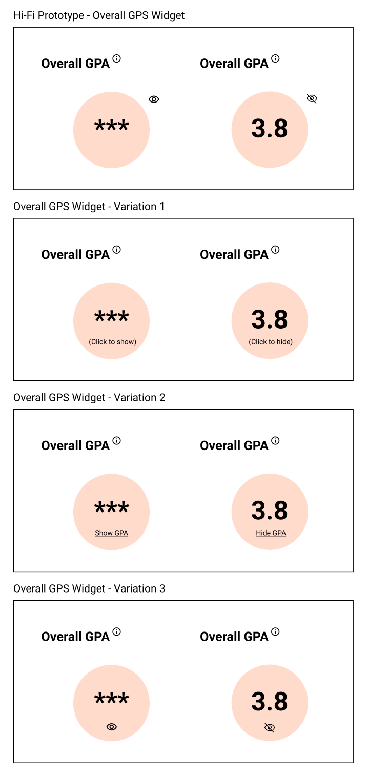
Lastly, the student is able to see their overall GPA, also referred to as cumulative GPA, on the right hand side. By default, this value is hidden to protect the student if they were in a situation where they did not want to reveal it, but the GPA can be easily un-hidden by clicking on the “eye” symbol next to the circle, which dynamically shows and hides this value.
To assist new students, each of the three aforementioned sections has a tooltip which can be accessed by hovering over the information icon adjacent to each title. This displays a brief explanation of what each area is displaying.
The second core section of the page displays the individual student’s course schedule for the active term. Students are able to see how many courses they’ve enrolled in at the top and are initially presented with a week-long calendar view of their courses. Clicking on any individual class tile on the calendar will open a pop-over with the general course information found in the course catalog as well as the meeting dates and times of that particular course.
If past or future schedules are desired, the student can change which week they’re viewing by selecting the date range above the calendar. By default, this is set to the current calendar week. If a list view is desired, students can also select this by interacting with the button at the top right of the panel. This displays the same information as the calendar view, but with the individual classes contained in dropdowns.
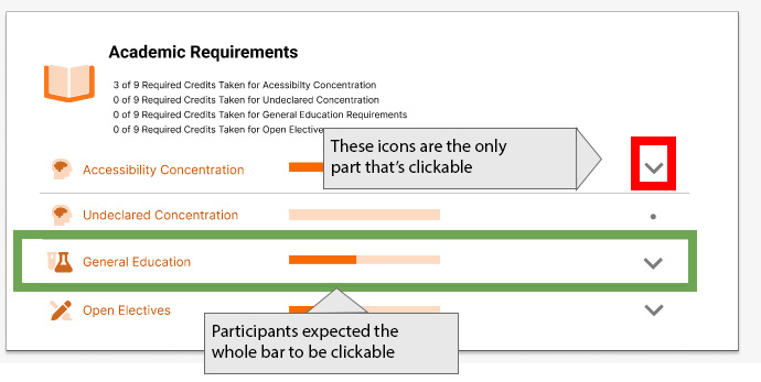
Below the course schedule is a panel for academic requirements. Initially, this panel displays the same information as was contained in the “overall progress” section near the top of the page, but also includes a dropdown for each individual requirement. When expanded, these sections provide a drilldown of each individual degree requirement. Any completed courses that count toward this requirement are listed first, as well as the number of credits they satisfy and the student’s final grade. Beneath that are a list of requirements the student must still complete to satisfy that portion of their degree. For each requirement, a list of applicable or eligible classes are shown to aid the student in selecting the correct course. If the list of courses extends beyond two lines, as shown here with open electives, a “Show More Classes” button is displayed which will expand the full list of eligible courses. Clicking on any individual course code will open the general information for that course pulled out of the catalog, including name, description, credit hours, and meeting times, among other information.
The mobile prototype features virtually the same information as the desktop variant, although a few key differences exist as some UI elements have been refactored to display correctly on smaller-width screens. In the first panel, the degree completed and overall GPA now stack underneath the overall progress section. The display of information as well as the dynamically visible GPA number remain unchanged.
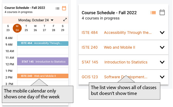
Because of the reduced width, the calendar has been reduced to a single day view which is a commonly used tactic for calendar apps on mobile phones. Students can still change the active week as well as the day of the week by interacting with the controls above the calendar itself. Students can freely switch between calendar and list views on mobile as well.
At the bottom of the page, the academic requirements section has been changed from dropdowns to tiles. Tapping any one of these tiles will bring the student to a subpage detailing the same information. Students can easily go back to the main page via the back arrow at the top of the screen.
Thank you for your attention during this brief presentation of the key features of the RIT Degree Tracker Prototype. If you have any questions or comments, please don’t hesitate to reach out.
User Testing and Evaluation
After we completed our HiFi prototype, we planned to test it on user profiles. We asked ourselves the following research questions:
- Is the presented degree tracking interface quicker and easier to use compared to the previous SIS interface?
- Is the presented degree tracking interface preferred by users compared to the previous SIS interface?
Setup and Methodology
Participants
To test our research questions, we tested 5 current RIT students who are already familiar with SIS. Although testing current users of the system may introduce bias, we thought it would be best to use direct user personas rather than user surrogates who are college students but not RIT students because they may catch any desirable functionality our prototype is missing and may be more critical of our system and the differences between them.
Session Outline and Timing
Session time: 32 minutes
- 5 minutes: background questions and orientation script
- Next 2 minutes: think aloud practice
- Next 15 minutes: Scenarios and task completion, post-task questions
- Next 5 minutes: Mobile evaluation and questions
- Next 5 minutes: post-test questionnaire, debrief and follow up questions
Test Plan Details
We conducted a within-subjects A/B experiment where we tested our version against the existing SIS academic requirements. The participant completed three tasks, varying which version is shown first (SIS vs ours).
| Participant | Task and Website Version Order | |||||
|---|---|---|---|---|---|---|
| P1 | A1 | B1 | A2 | B2 | A3 | B3 |
| P2 | B1 | A1 | B2 | A2 | B3 | A3 |
| P3 | A1 | B1 | A2 | B2 | A3 | B3 |
| P4 | B1 | A1 | B2 | A2 | B3 | A3 |
| P5 | A1 | B1 | A2 | B2 | A3 | B3 |
Task List
- Find the credits or classes needed to graduate.
Success Criteria
Preference: The participant's preference between SIS and the new site will be noted during the follow up questions of the test.
Performance: If the user completes the task with fewer than two mistakes, it will be deemed successful. White using the speak-out-loud technique, the task should not take longer than 20 seconds to complete.
Measurements
User preference, Time on task and Mouse clicks - Find your GPA.
Success Criteria
Preference: The participant's preference between SIS and the new site will be noted during the follow up questions of the test.
Performance: If the user completes the task with fewer than two mistakes, it will be deemed successful. White using the speak-out-loud technique, the task should not take longer than 20 seconds to complete.
Measurements
User preference, Time on task and Mouse clicks - Find current course details.
Success Criteria
Preference: The participant's preference between SIS and the new site will be noted during the follow up questions of the test.
Performance: If the user completes the task with fewer than two mistakes, it will be deemed successful. White using the speak-out-loud technique, the task should not take longer than 20 seconds to complete.
Measurements
User preference, Time on task and Mouse clicks
Scenarios
- Find the credits or classes needed to graduate
“You are looking to see how many credits/courses are left to take to graduate. How would you find this?” - Find your GPA
“Your major requirements require you to have above a 3.0 to remain in your program. How do you check your GPA?” - Find current course details
“You want to check the time and days one of the courses meets. How would you do this?”
Test Environment
The tests were conducted through a virtual zoom meeting. The participants joined the zoom meeting from their personal computer with a moderator and recorder watching. The moderator gave the participant control of their screen to complete scenarios on either the SIS or the new website.
Test Personnel Roles
- Moderator: The moderator is the sole communicator to the participant during the course of the study. The moderator walks the participant through the background questions, orientation script, scenarios, post-task questions, mobile feedback, post-test questionnaire and debrief.
- Recorder: The recorder takes notes on interactions between the participant and the software, as well as the participant's response to questions. The recorder can communicate with the moderator if necessary during the test through a private chat.
Results
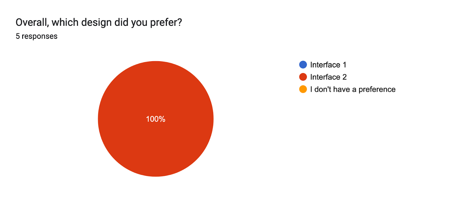
Our team interviewed five RIT graduate students to test three different scenarios in our prototype design and the current SIS system. The tasks included viewing the student's GPA, viewing the number of courses they have left to take, and viewing the times and dates of the courses offered. The importance of these tasks were later verified in a post-test questionnaire. Overall, the participants spent less time completing tasks and on average had lower mouse clicks using our prototype compared to the previous SIS system. Our prototype was preferred by all of the participants and received a 98.5 average SUS score compared to SIS which had a 32.5 average SUS score.
Task Completion and Performance
After completing the tasks on the current SIS website and our prototype, we had participants take a post-test questionnaire. On the questionnaire, we had participants rate the importance of the tasks they completed in the session. All of the participants felt that viewing the times and dates of the courses offered was very important, while 3 of them viewed seeing how many courses they had left as very important and 2 of them viewing that task as important. In regards to finding a student's GPA, 1 user found that task very important, 2 users found it important, while the other 2 users found it neutral and not important. On average, our scenarios were seen as Important or higher.
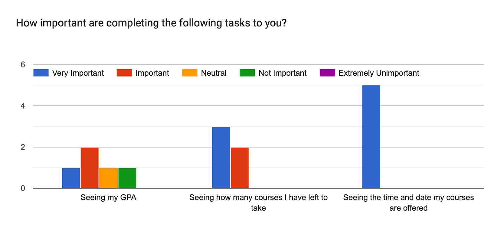
| Question: How important are completing the following tasks to you? | Average (Very important = 5, Important = 4, Neutral = 3, Not important = 2, Extremely unimportant = 1) |
|---|---|
| Seeing my GPA | 3.6 |
| Seeing how many courses I have left to take | 4.6 |
| Seeing the time and date my courses are offered | 5 |
Another question on the questionnaire was their preference on the prototype. In addition to this question, the new prototype was unanimously preferred in the SUS questions; all 5 students strongly agreed that the new prototype was easy to use. Among the reasons why the new prototype was easy to use were that the information was easy to find, it was less overwhelming, it was a better visualization, and required minimal effort to find information. All 5 students strongly agreed in feeling confident using the new prototype as well as strongly agreeing that most people would learn this new system quickly.
In the SUS questions, four out of the five students agreed that the current SIS system is unnecessarily complex while one student strongly agreed. This appeared evident when tracking the number of clicks between the two different systems. There were far fewer clicks in using the new prototype compared to using the SIS system as well as less time performing the tasks in the new prototype.
Participants rated each interface using the system usability scale (SUS). The SUS scores for each interface per participant and the average score show that the usability of the RIT Degree Tracker (98.5) is above average, while the SIS system (32.5) is below. The average SUS score is 68 (Affairs, 2013).
| Participants | SUS Score |
|---|---|
| P1 | 40 |
| P2 | 47.5 |
| P3 | 12.5 |
| P4 | 30 |
| P5 | 32.5 |
| Average | 32.5 |
| Participants | SUS Score |
|---|---|
| P1 | 100 |
| P2 | 100 |
| P3 | 97.5 |
| P4 | 95 |
| P5 | 100 |
| Average | 98.5 |
Improvements and Future Prototype Changes
Improvement 1:
Many participants had difficulties when finding how to show their GPA within our prototype (see Figure 4). All participants completed the task to find the GPA, but it took more time for them to see the eyeball icon and realize that is what needs to be pressed to view their GPA. In the post-task debrief, we asked for ways to make this action more clear. Text, displaying “Show GPA” and “Hide GPA” was suggested as an improvement. We discussed this issue as a group and concluded that we would change it to ‘Show’ and ‘Hide’ inside the circle and remove the eyeball icon entirely. Our variations can be seen in Figure 5. Additional testing should be done to show which version is best.
Improvement 2:
While no participants commented on the issue, the moderators noticed that participants often tried to click a spot in the accordion other than the icon. Future versions of the prototype should allow the entire bar to be clickable.

Other Issues to Consider:
For the ‘currently enrolled courses’ section we chose to have the calendar view show first, with an option to switch to list view. On the desktop prototype, all 5 participants liked the calendar view. However, opinions became more split on which view they preferred. The mobile calendar mock-up view is limited because it only shows one day at a time. Although you can switch the day of the week, some participants said they would rather see the class list instead of the calendar view first. This was especially true for a student who was only taking a few classes and wasn’t interested to see the time they were offered. One participant felt that the calendar was too squeezed-in for the mobile display. One participant suggested that they would prefer a list view with their time on the left of each course. Because opinions are split on this, It’s unclear what the solution is for this.
Conclusions, Limitations, and Further Research
Overall, our prototype was well received by participants. The new prototype is preferred over the SIS system unanimously. Although one user felt the SIS system has more information available, all five users did not feel that the SIS system was easy to use to perform the tasks at hand and strongly preferred the new prototype. The preference was apparent in the SUS scores as well; our prototype had a 98.5 score compared to the current SIS system at a 32.5 SUS score.
There are some limitations to this study. One limitation is that we only interviewed RIT students who happened to already use SIS. This can introduce potential bias towards the familiar system, and also improve the task completion rate because they are already familiar with the system. In our case, participants still performed much better on our system, but the difference might be even more apparent on new users. For example, one participant went to a very specific place on SIS to see a calendar view of their classes that we didn’t know was there and was able to answer the question on finding their class times very quickly. None of the other participants thought to look in that spot and took much longer to complete that task. In addition to having only tested RIT students, the study was also conducted on 5 participants who were all graduate students. It would be ideal to additionally interview undergraduate students in a variety of majors from other Colleges and Universities.
There are still some places where our interface could improve such as improving the way to hide and show GPA, making more of the accordion clickable and improving the mobile calendar view. Further iterations of the design and testing on it is recommended before moving into development, as well as testing additional participant profiles.
References
Affairs, A. S. for P. (2013, September 6). System usability scale (SUS). Usability.gov. Retrieved December 2, 2022, from https://www.usability.gov/how-to-and-tools/methods/system-usability-scale.html#:~:text=Interpreting%20Scores&text=Based%20on%20research%2C%20a%20SUS,to%20produce%20a%20percentile%20ranking.